TASSEL aslo known as Trait Analysis by aSSociation, Evolution and Linkage is a powerful statistical software to conduct association mapping such as General Linear Model (GLM) and Mixed Linear Model (MLM). The GUI (graphical user interface) version of TASSEL is very well built for anyone who does not have a background or experience in working in command line. In this tutorial, I will show how to prepare input files and run assoication analysis in TASSEL. For detailed information on TASSEL, user’s guide and further documentation please visit:
https://www.maizegenetics.net/tassel
Note: Please download a sample phenotype and genotype data (.hmp.txt format) from the below link:
Table of Contents
- Download TASSEL software
- Prepare Input files for TASSEL
- GWAS analysis (GLM and MLM
- GWAS Significance Threshold
- Plotting GWAS results in R
- Estimate and plot LD decay
1.1 Download and install TASSEL software
Download and install the latest version of the TASSEL software at this link:
https://www.maizegenetics.net/tassel
1.2: Preparing the Input files
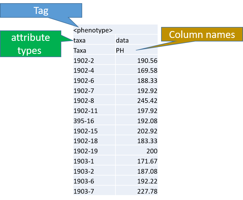
Phenotype file
Prepare the phenotype file as shown below in the figure
Note: Please remember if your data has covariates such as sex, age or treatment, then, please categories them with header name factor.
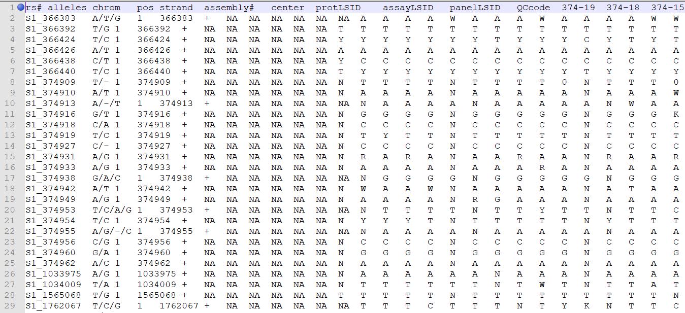
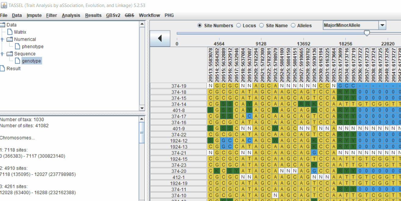
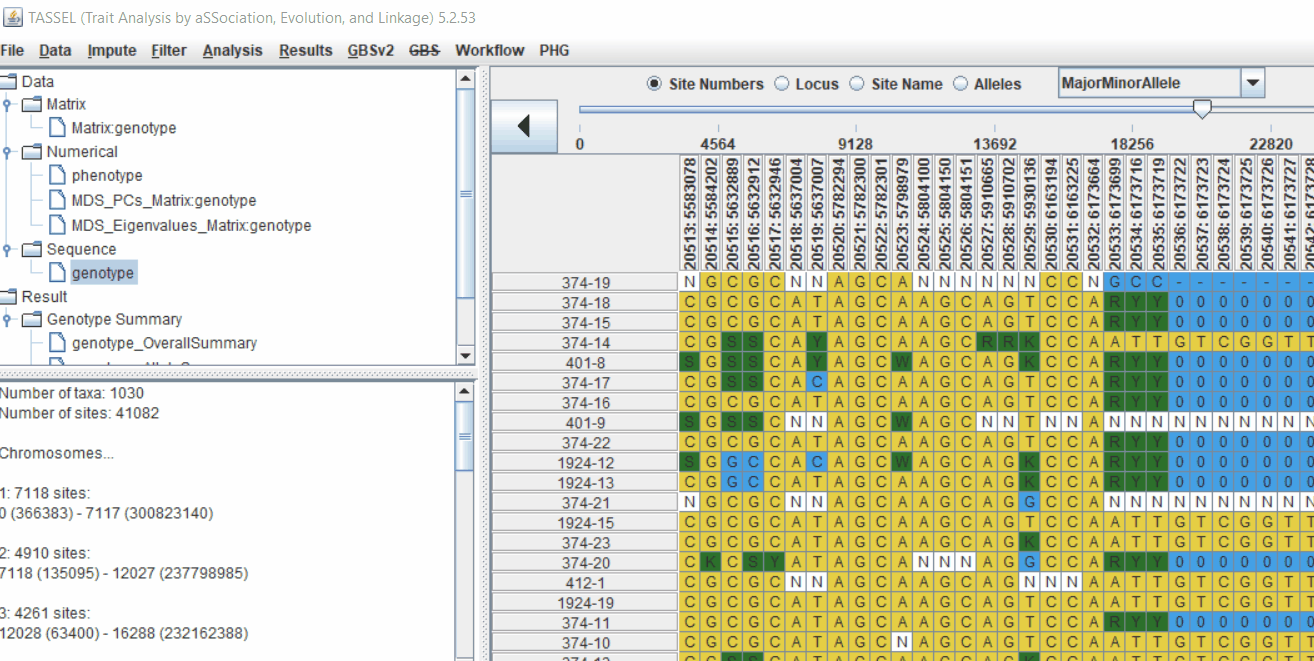
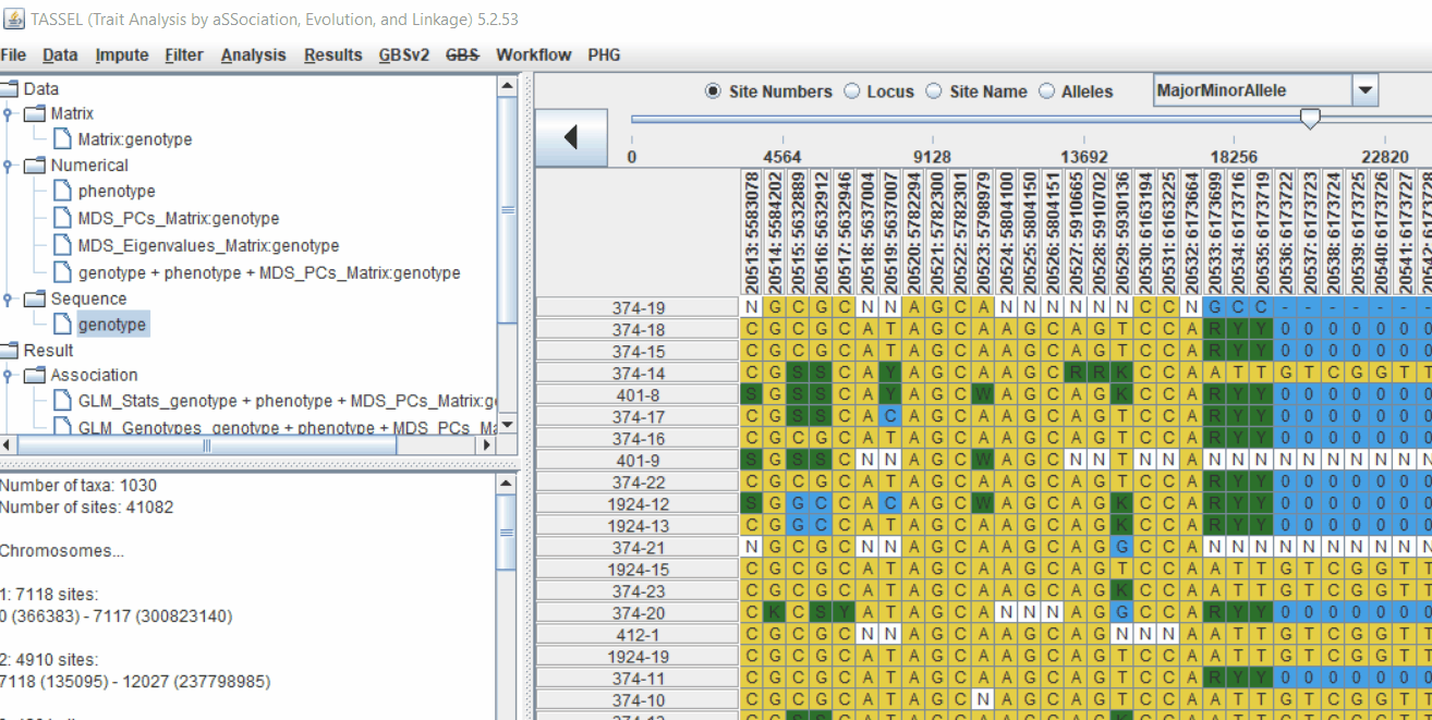
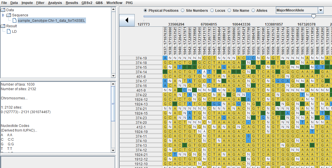
Genotype file
TASSEL allows various genotype file formats such as VCF (variant call format), .hmp.txt, and plink. In this tutorial, I am using the hmp.txt version of the genotype file. The below githe screenshot of the hmp.txt genotype file.
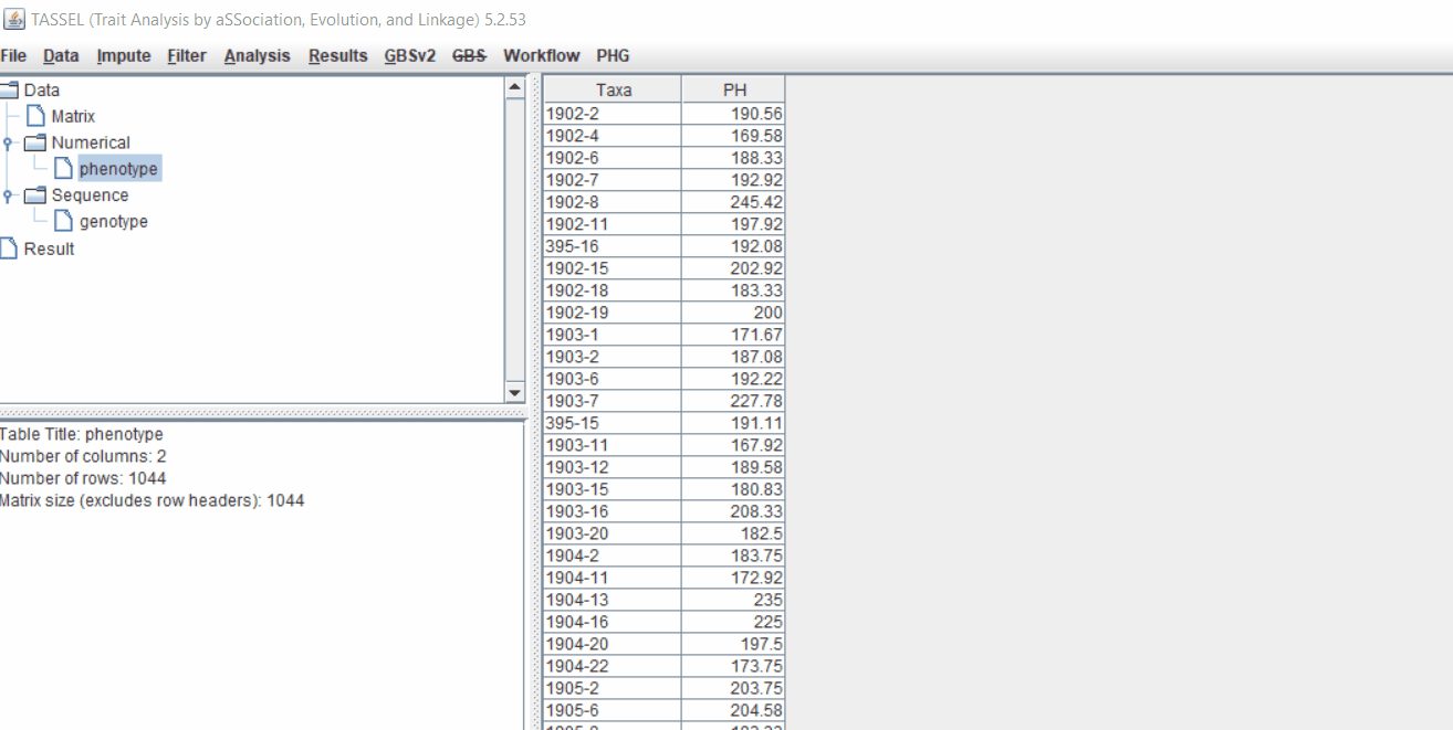
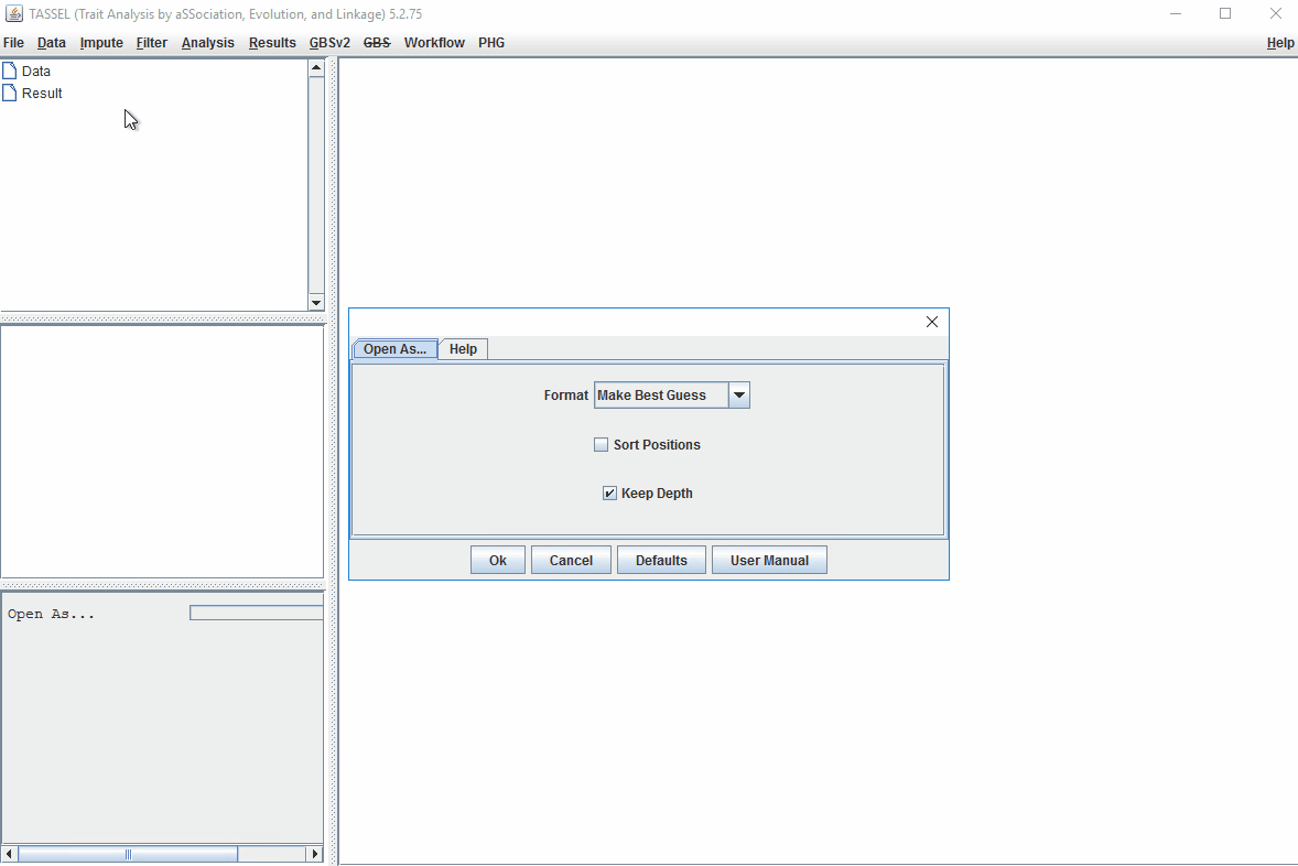
Step 1.2: Importing phenotype and genotype files
Import the files by following the steps shown below.
Tip! Both files can be opened at same time holding CTRL and clicking the file names.
1.3 Phenotype distribution plot
It is always a wise idea to look at the phenotype distribution by plotting to check for any outliers. Follow below steps to plot histogram of your phenotype data.
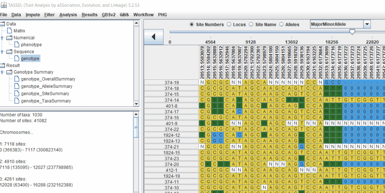
1.4 Genotype summary analysis
Next crucial step is to look at the genotype data by simply following the steps shown. Couple of keys things to look at are:
- Minor allele frequency distribution
- Missing genotypic data to see if it requires to be imputed
- Proportion of heterozygous in the samples to check for self-ed samples
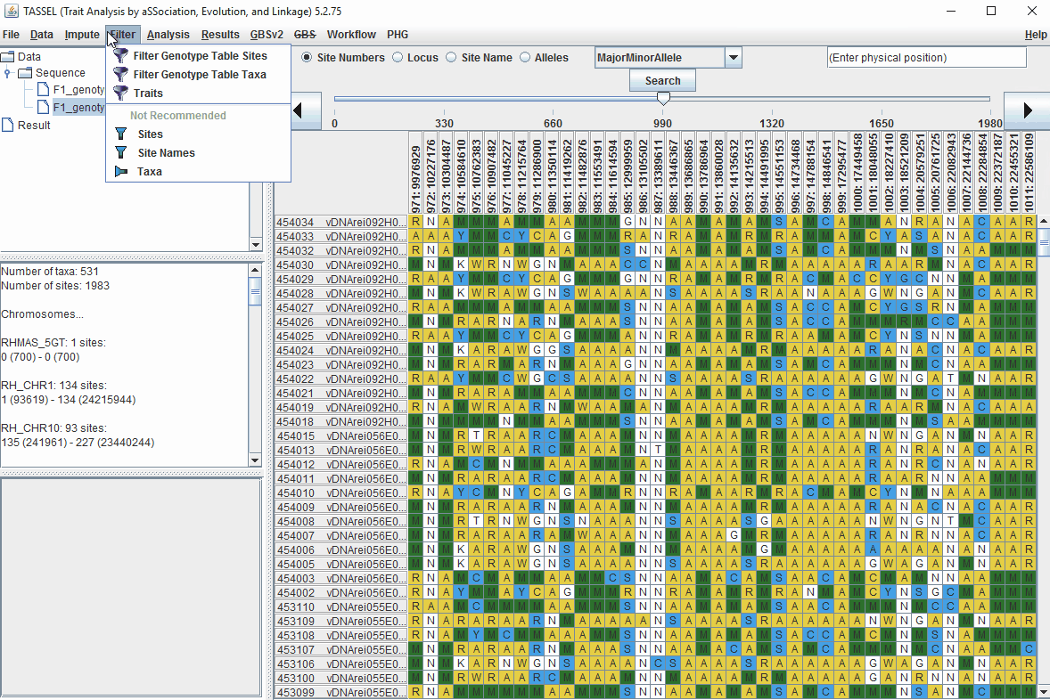
1.5 Filter genotypes based on call rate
Steps to filter the genotypes based on call rate and heterozygosity level are shown below:
In the video, genotypes were filtered based on listed parameters:
- 90% minimum sites persent
- 5% minimum heterozygosity
- 100% maxmimum heterozygosity
1.6 Filter Markers based on read depth, Minor and Major allele frequency (MAF)
Steps to filter markers based on read depth, Minor and Major allele frequency (MAF) are shown below:
In the video, markers were filtered based on listed parameters:
- 100 minimum count of 531 sequences (Its the number of times a particular allele was seen for that locus)
- 0.05 Minor allele Frequency (set filter thresholds for rare alleles)
- 0.95 Major allele frequency (set filter thresholds to remove monomorphic markers)
2.0 Conduct GWAS analysis
2.1 multidimensional scaling (MDS)
MDS output can be used as the covariate in the GLM or MLM to correct for population structure. Please follow the steps shown below:
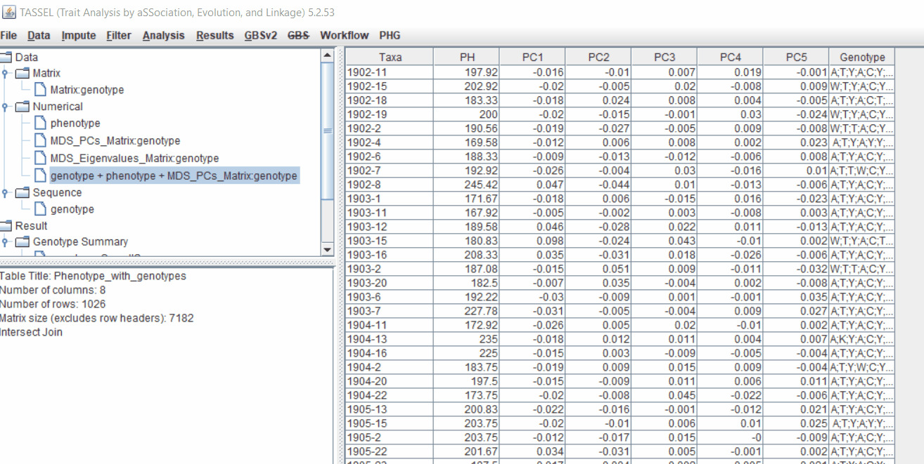
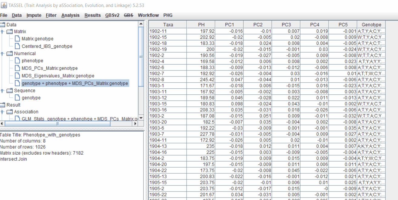
2.2 Intersecting the files
Intersect the genotype, phenotype and MDS files by following the steps below:
3.0 running General Linear Model (GLM)
Run the GLM analysis by selecting the intersected files following the steps below:
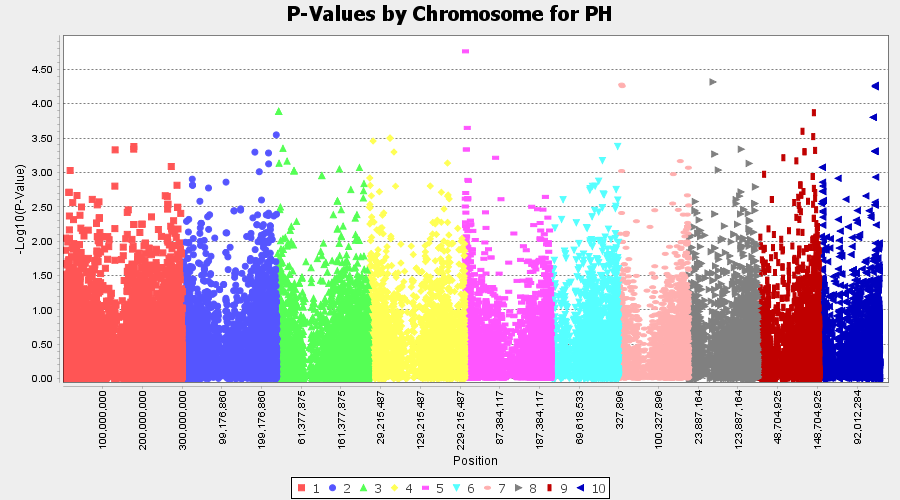
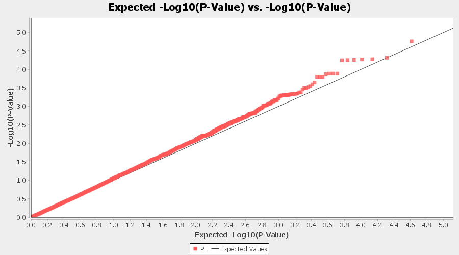
The output of the GLM analyis is produced ubder the Result node. The GLM association test can be evaluated by plotting Q-Q plot and the Manhattan plot as shown below.
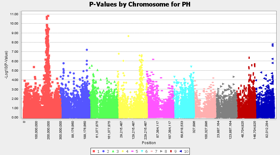
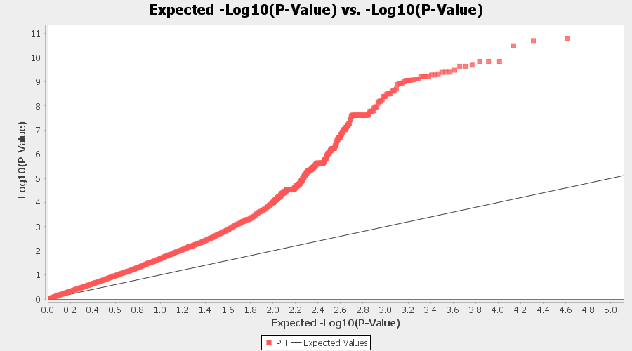
From the above Q-Q plot, we can see that are several markers that appear to be falsely associated with the trait, therefore, to control this confounding effect, use Kinship matrix as an another covariate in the linear model
4.0 Mixed Linear Model (MLM)
4.1 Calculating Kinship matrix
Follow the below steps to calcuate the kinship matrix:
4.2 running Mixed Linear Model (MLM)
MLM model includes the PCA and the kinship matrix i.e. MLM(PCA+K).
Therefore, once the Kinship matrix has been calculated, MLM can be now be conducted by following below steps:
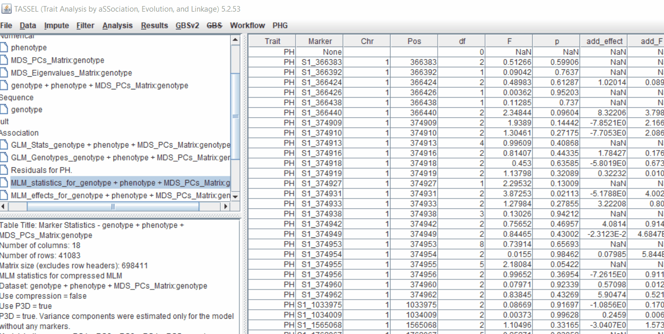
Plot the output (MLM stats file in the Results branch following the above shown steps).
4.4 Exporting results
One may export the results in .txt format by the following the below steps:
Determine GWAS Significance Threshold
Bonferroni threshold can be determined to identify significantly markers associated with the trait by using the below equation:
P ≤ 1/N (α =0.05)

For example:
If there are 13,169 sites (markers), then Bonferroni threshold would be = -log10(0.05/13169) = 5.42058279333
where, N is the total number of markers tested in association analysis) was used to identify the most significantly markers associated with the trait. Similarly, another way is to perform FDR (False Discoveyy Rate) correction method, which is a less stringent than the family-wise error rate.
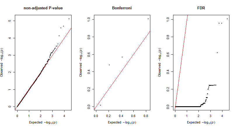
Adjust P-Values For Multiple Comparisons: Bonferroni and False Discovery Rate
Give the output from GLM and or MLM analysis, one calcuate the adjusted p-values using one of the frequenlty comparison methods: Bonferroni and False Discovery Rate (FDR)in R using the below code.
R code:
# Import GLM or MLM stats file.

  glm_stats <- read.table("GLMstats.txt", header = T, sep = "\t")

# Check data
  head(glm_stats)

# Import R library
library(dplyr)

# Calculate Bonferroni Correction and False Discovery Rate

adj_glm <- glm_stats %>%
  transmute(Marker, Chr, Pos, p,
            p_Bonferroni =  p.adjust(glm_stats$p,"bonferroni"),
            p_FDR = p.adjust(glm_stats$p,"fdr")
            )

View(adj_glm)

# Save the result to a file
write.csv(adj_glm, file="adj_p_GLM.csv", quote = T, eol = "\n", na= "NA")


# QQ plot
library(qqman)


# import data
adj_glm_KRN_4 <- read.csv("adj_p_GLM.csv", header = T)


#plot qq plot GLM(PCA)

par(mfrow=c(1,3))
qq(adj_glm_KRN_4$p, main = "non-adjusted P-value")
qq(adj_glm_KRN_4$p_Bonferroni, main = "Bonferroni")
qq(adj_glm_KRN_4$p_FDR, main = "FDR")
par(mfrow=c(1,1))
QQ plots of the For Multiple Comparisons:
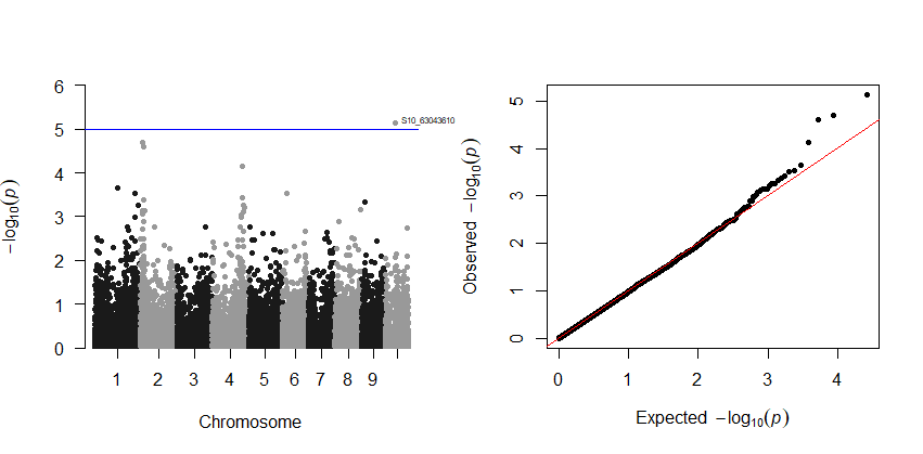
5.0 Plotting GWAS results in R using qqman package
The GLM and/or MLM stats can be plotted in R using the qqman package. Read more about the package here
R code to plot:
library(qqman)

# import data
mlm_stats <- read.table("GLMstats.txt", header = T, sep = "\t")


# Manhattan plot
manhattan(mlm_stats, chr="Chr", bp="Pos", snp="Marker", p="p", annotateTop = T,
          genomewideline = 5.42, suggestiveline = F)

# QQ plot
qq(mlm_stats$p)
Output:
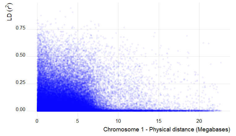
6.0 Estimation and plotting of LD decay over distance from the LD results from TASSEL
Steps are shown below:
Code to plot in R using GGplot:
library(ggplot2)

ld_chr1 <- read.table("LD_chr_1_50window.txt", header = T, na.strings = "NaN")

ggplot() +
  geom_point(aes(ld_chr1$Dist_bp/1000000, ld_chr1$R.2), na.rm = T, color ="blue", alpha=0.05) +
  labs(x="Chromosome 1 - Physical distance (Megabases)", y=expression(LD~(r^{2})))
Output of the LD decay plot for chromosome 1
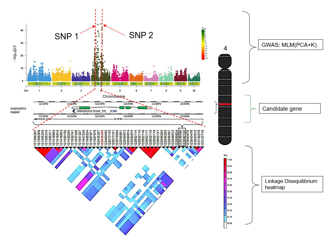
7.0 Flow chart of candidate gene analysis post GWAS
--- End of Tutorial ---
Thank you for reading this tutorial. If you have any questions or comments, please let me know in the comment section below or send me an email.
Bibliography
Bradbury PJ, Zhang Z, Kroon DE, Casstevens TM, Ramdoss Y, Buckler ES. (2007) TASSEL: Software for association mapping of complex traits in diverse samples. Bioinformatics 23:2633-2635.