Multidimensional Scaling (MDS) is a powerful statistical method that can be effectively used to elucidate hidden population structure, and more importantly, use it as a quality control tool while working on genetic data.
Note: I strongly encourage anyone to QC their data (phenotype or genotype data) before proceeding to any further data analysis. In my own research, I work with plethora of genetic data genetrated from the breeding programs, and I use MDS religiously to identify any possible pollen contamination (selfed or out-crossess), and or mislabled samples, and further, I use it as a population structure covariates in GLM and MLM in GWAS analysis.
In this tutorial, I will walk through how anyone can use easily run MDS analysis on their data in TASSEL software and visualize in R software. For detail information on MDS, please read this article at this link
What is MDS?
MDS is also known as Prinicpal Co-ordinate Analysis (PCoA), and produces results that are very similar to Principal Component Analysis (PCA). A genome-wide pairwise Identity-By-State (IBS) distance matrix using the genotype data is first calculated, then following the MDS analysis.
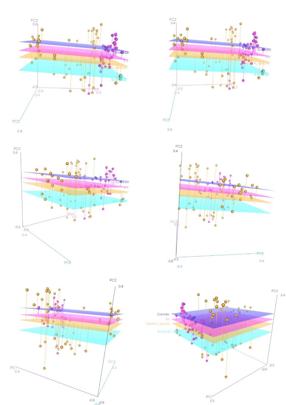
Calculating MDS
In this tutorial, I will show how to calculate MDS in TASSEL software. If you are familiar with TASSEL or do not have it installed on your computer, then, please download and go through its documentation at this link .
Step: 1 Import data in TASSEL
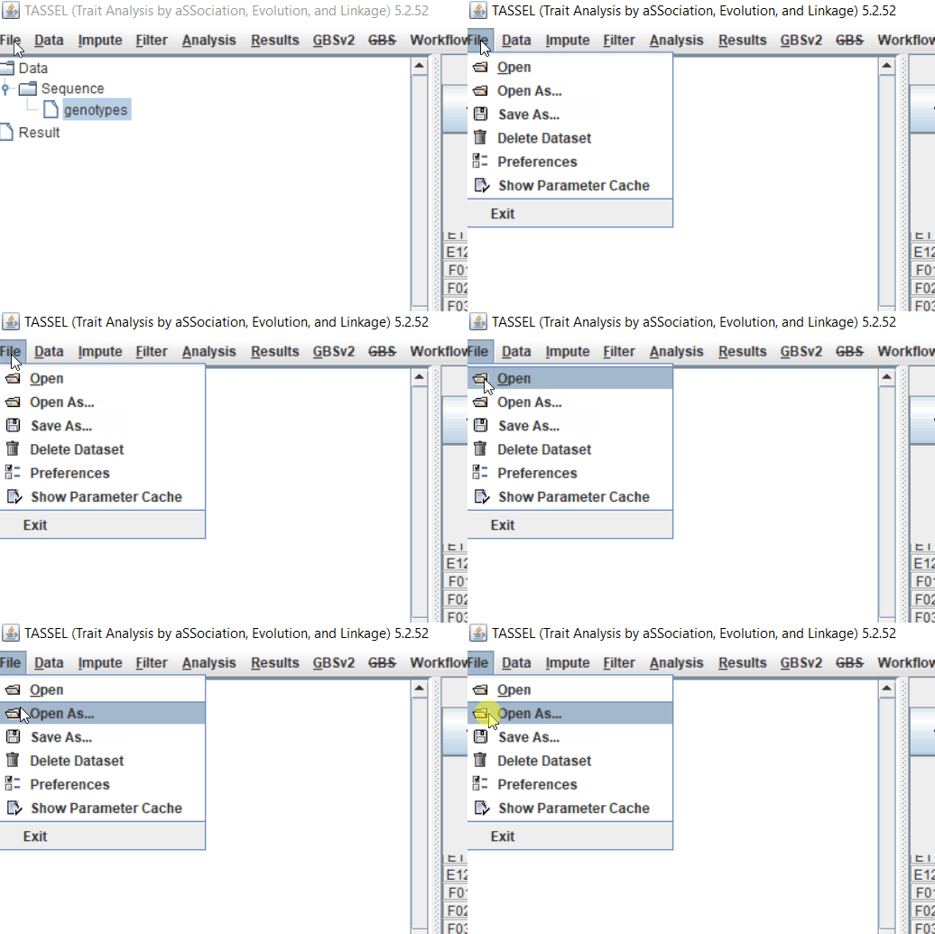
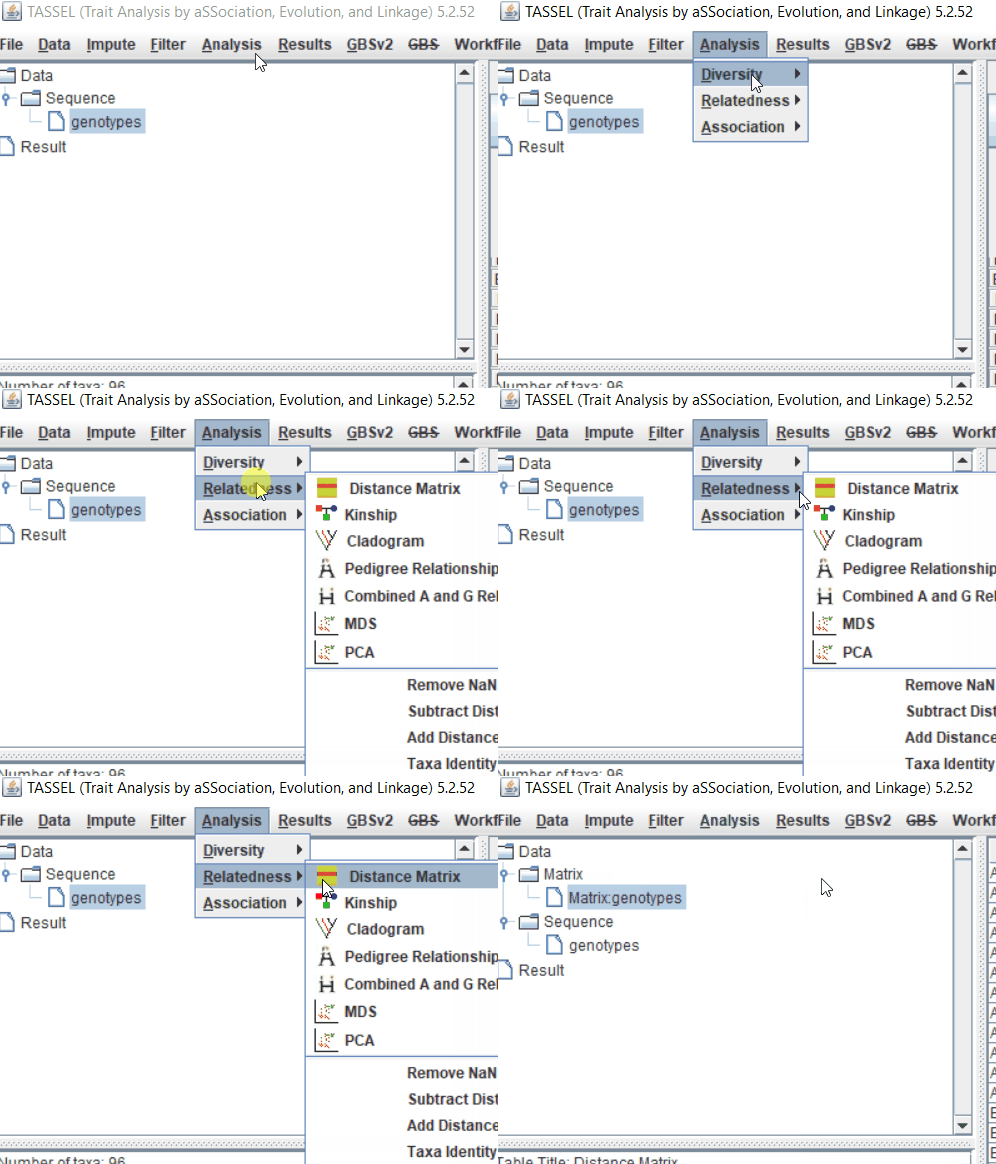
Step: 2 Calculate distance matrix
Step: 3 Calculate MDS
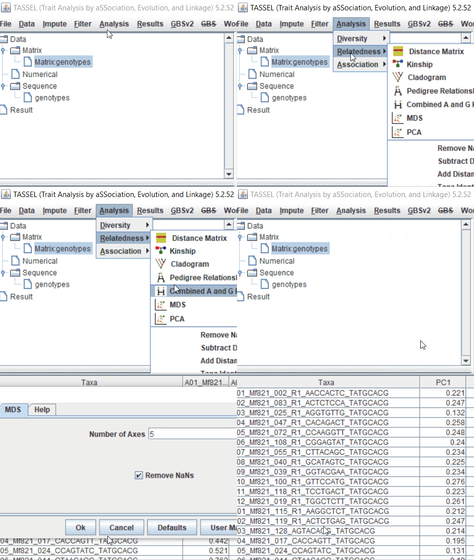
Step: 4 Plot PCoAs in TASSEL
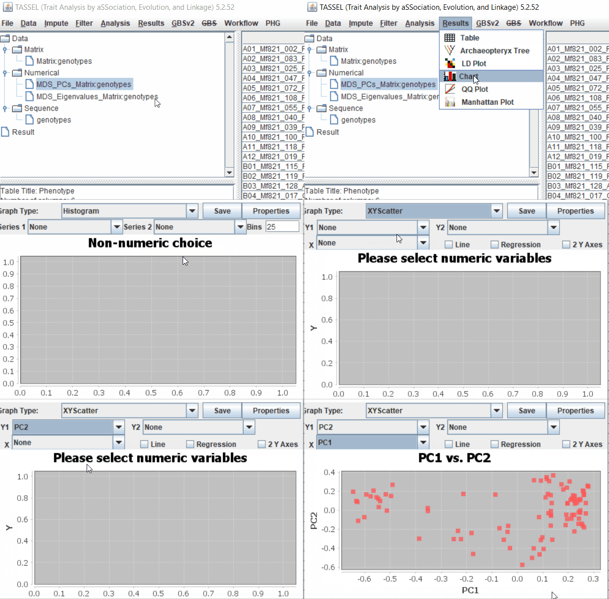
Optional step: Plotting in R using ggplot2
Export the MDS results as a .txt file and edit in MS Excel to add the below header and information to plot in ggplot2.
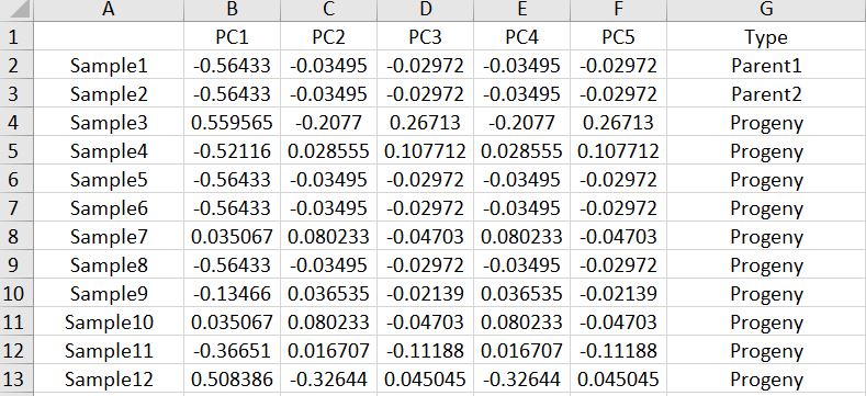
Once the file has bee formatted, One may plot the PCoA results using ggplot2 library in R software using the below commands:
  #Library
  library(ggplot2)

  #import MDS data
  MDS = read.table("MDS.txt", header = T)

  head(MDS)

  #Plot MDS
  MDS_plot <- ggplot(MDS, aes(x=PC1,y=PC2,color=Type, cex=1, label=Sample))
  MDS_plot <- MDS_plot + geom_point() + geom_text(aes(label=Sample),hjust=0, vjust=0)
  MDS_plot
Output
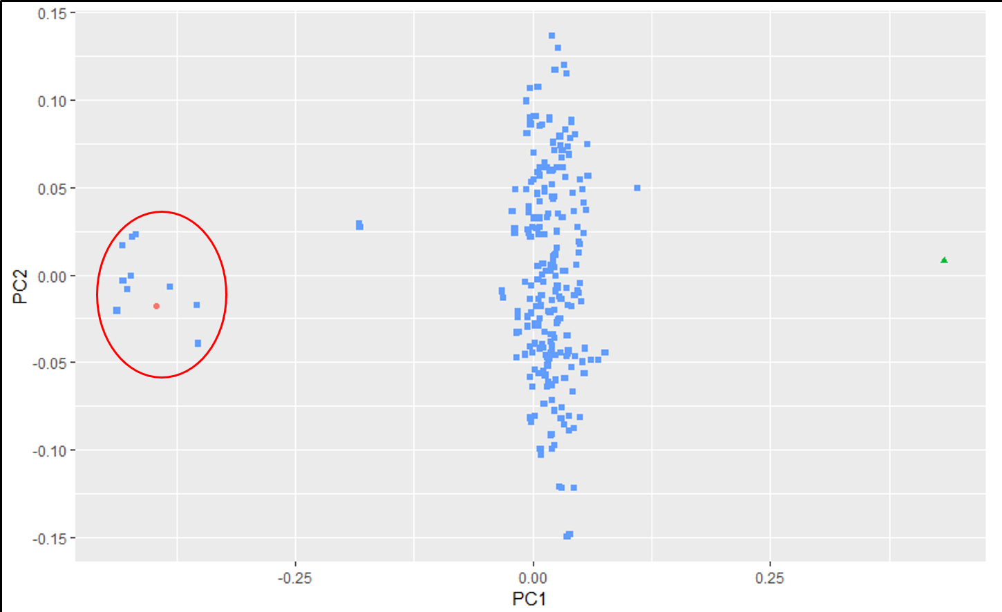
An example of an ouptut from the R command is shown below. In the figure below, the samples represent PCoA of samples from a F1 cross, and one may see that most of the F1 progenies cluster between the parent clusters on the left and right, whereas, there are a few samples (in circle) that cluster with one of the parents indicating that they were a self-pollinated.
--- End of Tutorial ---
Thank you for reading this tutorial. If you have any questions or comments, please let me know in the comment section below or send me an email.
Happy QC-ing !
Bibliography
Bradbury, Peter J., et al. "TASSEL: software for association mapping of complex traits in diverse samples." Bioinformatics 23.19 (2007): 2633-2635.
Tzeng, Jengnan, Henry Horng-Shing Lu, and Wen-Hsiung Li. "Multidimensional scaling for large genomic data sets." BMC bioinformatics 9.1 (2008): 179.