In this tutorial, negative binomial was used to perform differential gene expression analyis in R using DESeq2, pheatmap and tidyverse packages. The workflow for the RNA-Seq data is:
- Obatin the
FASTQsequencing files from the sequencing facilty - Assess the
qualityof the sequencing reads - Perform
genome alignmentto identify the origination of the reads - Generate the
count matrixof the aligned reads i.e. the number of reads aligning to the exons of each gene.
Table of Contents
- Import Gene Count and Meta data
- QC analysis
- Variance Stablizing Tranformation
- Differential Gene Expression
- Top DF genes
- Visualizing DF genes
The dataset used in the tutorial is from the published Hammer et al 2010 study. The read count matrix and the meta data was obatined from the Recount project website Briefly, the Hammer experiment studied the effect of a spinal nerve ligation (SNL) versus control (normal) samples in rats at two weeks and after two months. In this tutorial, we explore the differential gene expression at first and second time point and the difference in the fold change between the two time points.
Download the slightly modified dataset at the below links:
Step 1.0 Loading data Gene count and Metadata in R
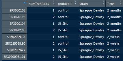
There are eight samples from this study, that are 4 controls and 4 samples of spinal nerve ligation. The meta data contains the sample characteristics, and has some typo which i corrected manually (Check the above download link).
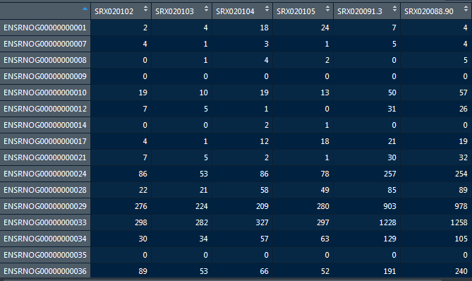
Import the read count data using the below R code:
Use View function to check the full data set.
read_Count <- read.table("hammer_count_table.txt", header = T)


#View(read_Count)

head(read_Count)
dim(read_Count)
Import the metadata
Use View function to check the full data set.
metadata <- read.table("hammer_phenodata.txt", header = T)

#View(metadata)

head(metadata)
Step 1.1 Preparing the data for DESeq2 object
Prior to creatig the DESeq2 object, its mandatory to check the if the rows and columns of the both data sets match using the below codes.
Call row and column names of the two data sets:
rownames(metadata)

colnames(read_Count)
Finally, check if the rownames and column names fo the two data sets match using the below code.
all(rownames(metadata) == colnames(read_Count))
In case, while you encounter the two dataset do not match, please use the match() function to match order between two vectors.
match(rownames(metadata), colnames(read_Count))

idx <- match(rownames(metadata), colnames(read_Count))

reordered_metaData <- metadata[idx,]

View(reordered_metaData)

# check the order

all(rownames(reordered_metaData) == colnames(read_Count))
Step 1.2 Load the required libraries
# Load library for DESeq2
library(DESeq2)
# Load library for RColorBrewer
library(RColorBrewer)
# Load library for pheatmap
library(pheatmap)
# Load library for tidyverse
library(tidyverse)
Step 1.3 Create the DESeq2 object
# Create matrix
dds <- DESeqDataSetFromMatrix(countData= read_Count,
                                      colData = reordered_metaData,
                                      design = ~ 1)
Step 2.1 Quality Control analysis
Normalization
We need to normaize the DESeq object to generate normalized read counts.
Determine the size factors to be used for normalization using code below:
dds <- estimateSizeFactors(dds)

sizeFactors(dds)

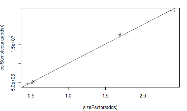
Plot column sums according to size factor
plot(sizeFactors(dds), colSums(counts(dds)))
abline(lm(colSums(counts(dds)) ~ sizeFactors(dds) + 0))
Step 2.2 Exploratory data analysis
We can coduct hierarchical clustering and principal component analysis to explore the data.
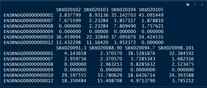
First we extract the normalized read counts
normlzd_dds <- counts(dds, normalized=T)

head(normlzd_dds)
Hierarchical clustering
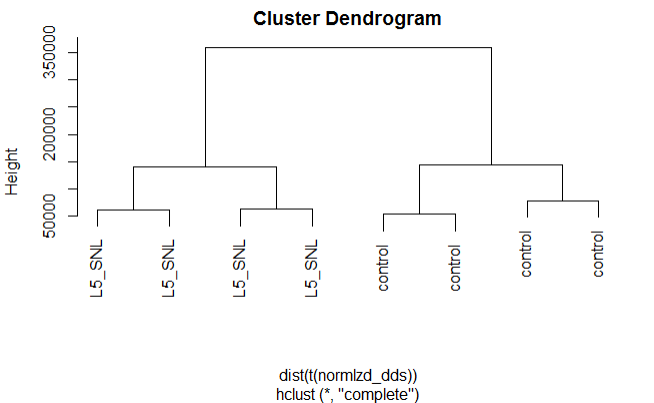
Hierarchical clustering by protocol
plot(hclust(dist(t(normlzd_dds))), labels=colData(dds)$protocol)
Hierarchical clustering by time
plot(hclust(dist(t(normlzd_dds))), labels=colData(dds)$Time)
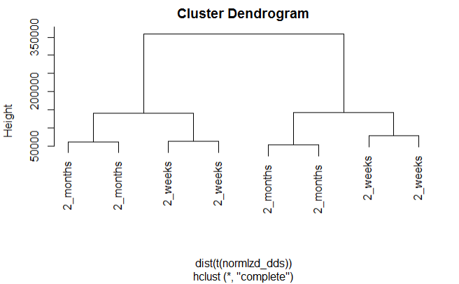
We can see from the above plots that samples are cluster more by protocol than by Time.
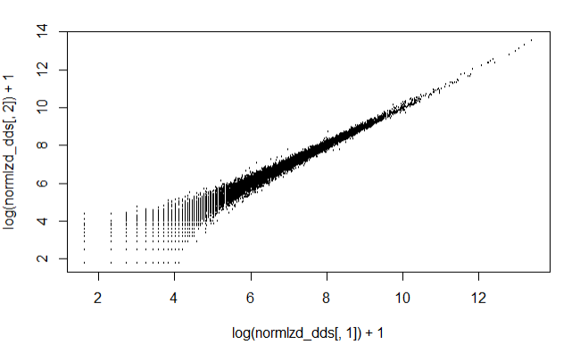
Log accounts of the first two samples against each other
From the below plot we can see that there is an extra variance at the lower read count values, also knon as Poisson noise.
plot(log(normlzd_dds[,1])+1, log(normlzd_dds[,2])+1, cex =.1)
Step 3.1 Variance Stablizing transformation
We use the variance stablizing transformation method to shrink the sample values for lowly expressed genes with high variance.
# Varaiance Stabilizing transformation
vsd <- vst(dds, blind = T)

# extract the vst matris from the object
vsd_mat <- assay(vsd)

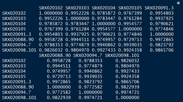
# compute pairwise correlation values
vsd_cor <- cor(vsd_mat)

vsd_cor
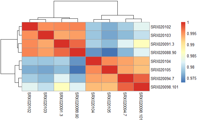
Step 3.2 Compute correlation values between samples using heatmap
pheatmap(vsd_cor)
Step 3.3 Principal Component Analysis(PCA)
We perform PCA to check to see how samples cluster and if it meets the experimental design.
plotPCA(vsd, intgroup = "protocol")
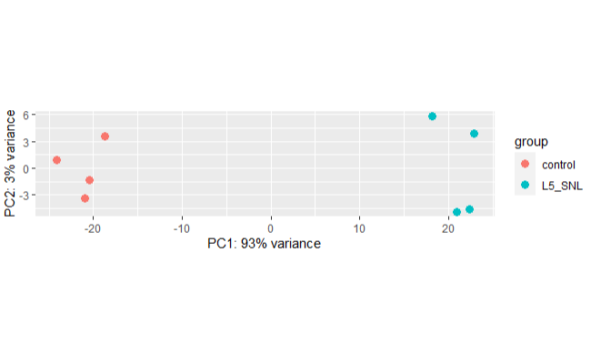
We can see from the above PCA plot that the samples from separate in two groups as expected and PC1 explain the highest variance in the data.
Step 3.4 Mean-variance relationship of the first 3 samples
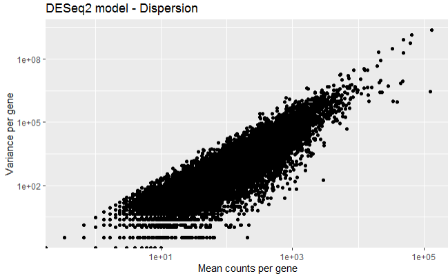
The below plot shows the variance in gene expression increases with mean expression, where, each black dot is a gene. Similarly, genes with lower mean counts have much larger spread, indicating the estimates will highly differ between genes with small means.
First calculate the mean and variance for each gene.
# Calculating mean for each gene
mean_readCounts <- apply(read_Count[,1:3], 1, mean)

# Calculating variance for each gene
var_readCounts <- apply(read_Count[,1:3], 1, var)
Plot the mean versus variance in read count data
df <- data.frame(mean_readCounts, var_readCounts)

# ggplot2 library
library(ggplot2)

ggplot(df) +
  geom_point(aes(x=mean_readCounts, y= var_readCounts)) +
  scale_y_log10() +
  scale_x_log10() +
  xlab("Mean counts per gene") +
  ylab("Variance per gene") +
  labs(title = "DESeq2 model - Dispersion")
Step 4.1 Differential gene expression
Its crucial to identify the major sources of variation in the data set, and one can control for them in the DESeq statistical model using the design formula, which tells the software sources of variation to control as well as the factor of interest to test in the differential expression analysis.
In this data, we have identified that the covariate protocol is the major sources of variation, however, we want to know contr=oling the covariate Time, what genes diffe according to the protocol, therefore, we incorporate this information in the design parameter.
Step 4.2 Run DESeq2 pipeline
The below codes run the the model, and then we extract the results for all genes.
design(dds) <- ~ Time + protocol

dds <- DESeq(dds)
Significant DE genes - Summary
res <-results(dds)


summary(res)
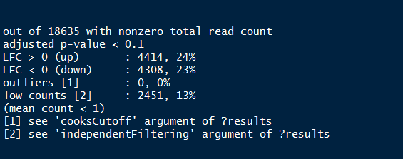
Summary of the above output provides the percentage of genes (both up and down regulated) that are differentially expressed.
Step 4.3 MA-plot
We can plot the fold change over the average expression level of all samples using the MA-plot function.
plotMA(res, ylim=c(-5,5) )
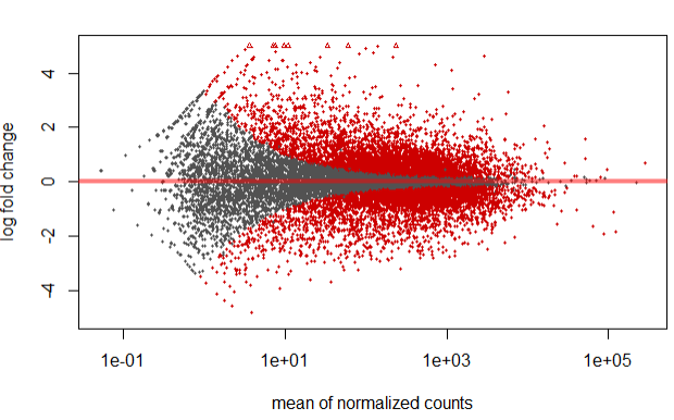
In the above plot, highlighted in red are genes which has an adjusted p-values less than 0.1
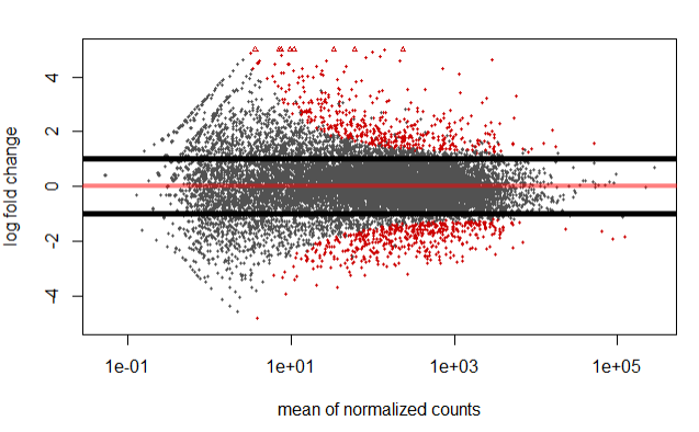
However, we can also specify/highlight genes which have a log 2 fold change greater in absolute value than 1 using the below code.
resBigFC <- results(dds, lfcThreshold=1, altHypothesis="greaterAbs")
plotMA(resBigFC, ylim=c(-5,5))
abline(h=c(-1,1),lwd=5)
Step 4.4 Fit curve to gene-wise dspersion estimates
The below curve allows to accurately identify DF expressed genes, i.e., more samples = less shrinkage.
Note genes with extremly high dispersion values (blue circles) are not shrunk toward the curve, and only slightly high estimates are.
plotDispEsts(dds)
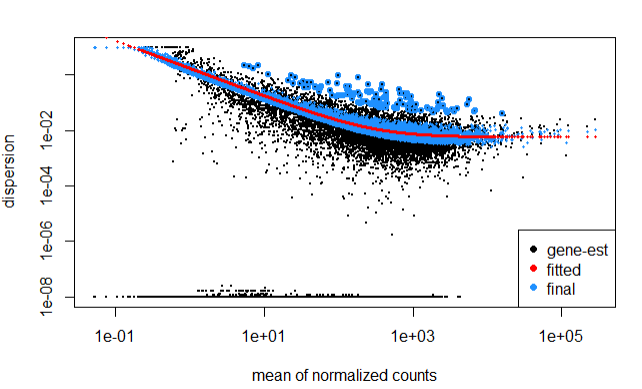
In the above plot, the curve is displayed as a red line, that also has the estimate for the expected dispersion value for genes of a given expression value.
Step 5.1 Top DF genes: sort by pvalue
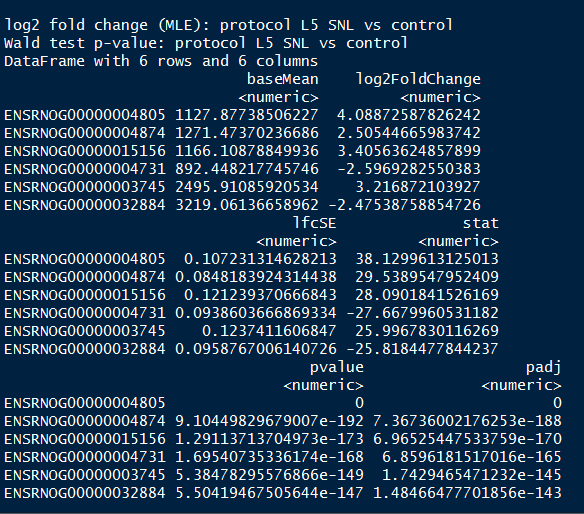
In this step, we identify the top genes by sorting them by p-value.
resSort <- res[order(res$pvalue),]

head(resSort)
Step 5.2 Check the annotation of these highly significant genes:
First install below library/
# if (!requireNamespace("BiocManager", quietly = TRUE))
#     install.packages("BiocManager")
#
# BiocManager::install("org.Rn.eg.db")

library(org.Rn.eg.db)
#The keys we can query on Ensembl
keytypes(org.Rn.eg.db)
head(rownames(dds))
The first 20 genes according to the lowest p-value
head(resSort, n=10)

geneinfo <- select(org.Rn.eg.db, keys=rownames(resSort)[1:20],
                   columns=c("ENSEMBL", "SYMBOL","GENENAME"),
                   keytype="ENSEMBL")
geneinfo
Step 6 visualizing results of the DF genes
Expression Heatmap
This plot is helpful in looking at how different the expression of all significant genes are between sample groups.
res_sig <- data.frame(normlzd_dds[geneinfo$ENSEMBL, ])

#View(res_sig)

#sig_norm_counts <- [wt_res_sig$ensgene, ]

heat_colors <- brewer.pal(6, "YlOrRd")

# Run pheatmap
pheatmap(res_sig,
        color = heat_colors,
        cluster_rows = T,
        show_rownames = T,
        annotation = dplyr::select(metadata, protocol),
        scale = "row"
        )
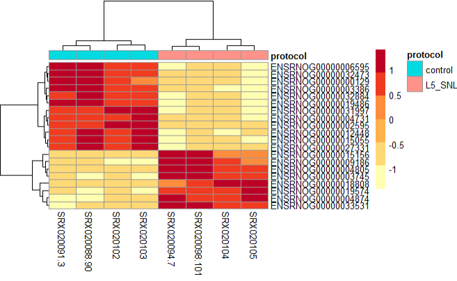
From the above plot, we can see the both types of samples tend to cluster into their corresponding protocol type, and have variation in the gene expression profile.
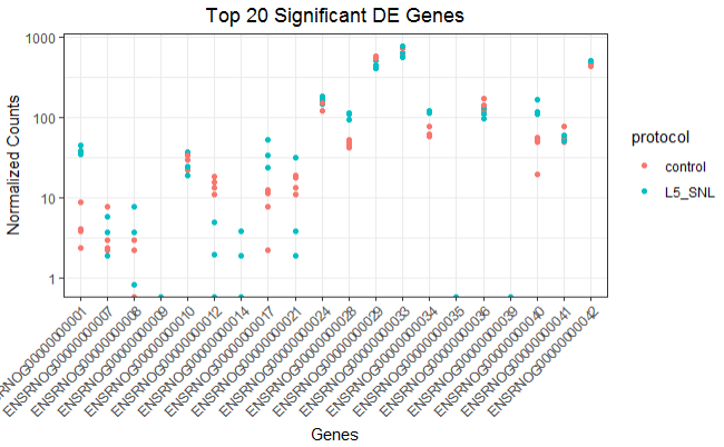
Expression plot of the top 20 genes
Similarly, This plot is helpful in looking at the top significant genes to investigate the expression levels between sample groups.
top_20 <- data.frame(normlzd_dds)[1:20, ] %>%
  rownames_to_column(var = "ensgene")

top_20 <- gather(top_20,
                 key = "samplename", value = "normalized_counts", 2:8)

top_20 <- inner_join(top_20, rownames_to_column(reordered_metaData,
                     var  = "samplename"), by = "samplename")

ggplot(top_20) +
  geom_point(aes(x = ensgene, y = normalized_counts, color = protocol)) +
  scale_y_log10() +
  xlab("Genes") +
  ylab("Normalized Counts") +
  ggtitle("Top 20 Significant DE Genes") +
  theme_bw() +
  theme(axis.text.x = element_text(angle = 45, hjust = 1)) +
  theme(plot.title = element_text(hjust = 0.5))
References
Hammer P, Banck MS, Amberg R, Wang C, Petznick G, Luo S, Khrebtukova I, Schroth GP, Beyerlein P, Beutler AS. “mRNA-seq with agnostic splice site discovery for nervous system transcriptomics tested in chronic pain.” Genome Res. 2010
Simon Anders and Wolfgang Huber, “Differential expression analysis for sequence count data”, Genome Biology 2010.
Mortazavi A, Williams BA, McCue K, Schaeffer L, Wold B., “Mapping and quantifying mammalian transcriptomes by RNA-Seq”, Nat Methods. 2008.
John C. Marioni, Christopher E. Mason, Shrikant M. Mane, Matthew Stephens, and Yoav Gilad, “RNA-seq: An assessment of technical reproducibility and comparison with gene expression arrays” Genome Res. 2008.