Ideally alleles or haplotype of a single or multiple markers identified post-GWAS or QTL analysis are used to evaluate their effect on a trait of interest. The goal of this tutorial is to visualize the allele effects of a genetic marker on a trait (phenotype) utilizing a R package ggstatsplot developed by Indrajeet Patil, and use its in-built parameters to test the statistical significance of the effect sizes. ggstatsplot produces publication quality figures with descriptive and inferential statisitcs, and requires minimal coding experience to analyze their data.
- Install ggstatsplot in R
- Creating input file
- Download sample file
- Importing data in R environment
- Plotting allele effect & Parameters
- Citation
1. Install ggstatsplot in R
The latest version 0.9.1 of the ggstatsplot can be installed using the below code:
install.packages("ggstatsplot")

library(ggstatsplot)
- ggstatsplot requires R version >=4.0
2. Creating input file
An input file can be a text(.txt) or comma separated file (.csv) in a format shown in an screenshot below:
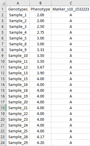
Description of the columns or header in the file are:
Genotypes : List of sample names
Phenotype : Column containing phenotypic data
Marker_s10_1532223 : Marker name and its allele calls of the corresponding samples
3. Download sample file
Please downnload sample file from below links:
4. Importing data in R environment
The input file can imported into R environment via below line of codes:
library(ggstatsplot)

input <- read.table("inputFile.txt", header = T)

head(input)
Output –>
> head(input)
  Genotypes Phenotype Marker_s10_1532223
1  Sample_1      2.00                  A
2  Sample_2      2.00                  A
3  Sample_3      2.50                  A
4  Sample_4      2.75                  A
5  Sample_5      3.00                  A
6  Sample_8      3.00                  A
Note: Alleles of multiple markers can be added via concating the allele calls of a marker set for a list of sample. For example: A;G;A. Also, please remove any missing allele (“N”) calls in the data or else it will be considered as an allele state and not treated as missing data.
5. Plotting allele effect & Parameters
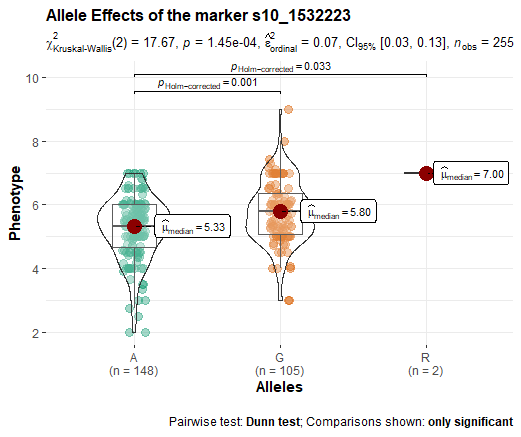
Code to plot the allele effects using ggbetweenstats function:
ggbetweenstats(
  data  = input,
  x     = Marker_s10_1532223 ,
  y     = Phenotype   , type = "n", pairwise.comparisons = T,
  xlab = "Alleles",
  ylab = 'Phenotype',
  title = "Allele Effects of the marker s10_1532223"
)
Output –>
Description of the parameters in the above code are:
data : Obejct containing the input file
x : X-axis of the marker containing allele/haplotype calls
y : Y-axis of the phenotypic values
xlab : renaming x-axis label
ylab : renaming y-axis label
title : title of the plot
type : distribution of the data type
Note: You can define the distribution of your data, that is: parameteric or non-paratemeric using the type parameter, and perform pairwise-comparison. Also, if you have unbalanced data per group make sure type=np to calculate the non-parameteric pairwise-comparsion test a.k.a Dunn test.
To see all supported plots and statistical analyses, see the package website: https://indrajeetpatil.github.io/ggstatsplot/
Thank you for reading this tutorial. I really hope these steps will assist in your analysis. If you have any questions or comments, please comment below or send an email.
6. Citation
Patil, I. (2021). Visualizations with statistical details: The 'ggstatsplot' approach. Journal of Open Source Software, 6(61), 3167, doi:10.21105/joss.03167